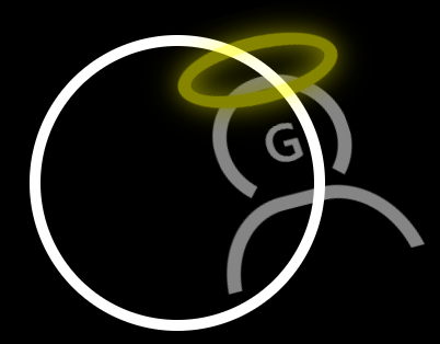
最近上課 & 上班快要登出 , 就順手寫看看 , 一樣沙雕的登出 style XD
要留意的點就是 *::before{box-sizing} 的部分 , 想說 before 寫半天都沒法對準父層
See the Pen
Sign Out by weber87na (@weber87na)
on CodePen.
1
2
3
4
5
6
7
8
9
10
11
12
13
14
15
16
17
18
19
20
21
22
23
24
25
26
27
28
29
30
31
32
33
34
35
36
37
38
39
40
41
42
43
44
45
46
47
48
49
50
51
52
53
54
55
56
57
58
59
60
61
62
63
64
65
66
67
68
69
70
71
72
73
74
75
76
77
78
79
80
81
82
83
84
85
86
87
88
89
90
91
92
93
94
95
96
97
98
99
100
101
102
103
104
105
106
107
108
109
110
111
112
113
114
115
116
117
118
119
120
121
122
123
124
125
126
127
128
129
130
131
132
133
134
135
| <html lang="zh-Hant">
<head>
<meta charset="UTF-8">
<meta name="viewport"
content="width=device-width, initial-scale=1.0, shrink-to-fit=no">
<title>Document</title>
<style>
* {
margin: 0;
padding: 0;
font-family: '微軟正黑體';
}
*::before,
*::after {
box-sizing: border-box;
;
}
body {
display: flex;
height: 100vh;
align-items: center;
justify-content: center;
background-color: #000;
overflow: hidden;
}
.wrap {
width: 250px;
height: 250px;
border-radius: 50%;
border: 10px solid white;
display: flex;
align-items: center;
justify-content: center;
position: relative;
}
.wrap span {
position: absolute;
top: 0;
left: 0;
}
.ring {
width: 100px;
height: 30px;
border-radius: 50%;
border: solid 10px yellow;
box-shadow:
0 0 20px yellow,
inset 0 0 20px yellow;
position: absolute;
top: 20px;
left: 0;
right: 0;
margin: 0 auto;
}
.person {
width: 200px;
height: 200px;
/* background-color: red; */
/* border: 5px solid #fff; */
/* border-radius: 50%; */
position: relative;
box-sizing: content-box;
overflow: hidden;
animation: smoky 3s;
}
.person::before {
content: '';
position: absolute;
top: 50%;
left: 50%;
width: 100px;
height: 100px;
border-radius: 50%;
border: 10px solid white;
border-color: white white transparent white;
transform: translate(-50%, -50%);
}
.person::after {
content: '';
width: 150px;
height: 180px;
border-radius: 40%;
border: 10px solid white;
position: absolute;
bottom: -120px;
left: 0;
right: 0;
margin: 0 auto;
}
.text {
position: absolute;
margin: 0 auto;
text-align: center;
top: 50%;
left: 50%;
transform: translate(-50%, -50%);
color: white;
font-size: 36px;
font-weight: bold;
cursor: hand;
text-align: center;
text-shadow: 0 0 0 whitesmoke;
}
@keyframes smoky {
to{
transform:
translate3d(200px, -80px, 0) rotate(-40deg) skewY(10deg)scale(1.5);
text-shadow: 0 0 20px whitesmoke;
opacity: 0;
}
}
</style>
</head>
<body>
<div class="wrap">
<div class="person">
<div class="text">G</div>
<div class="ring"></div>
</div>
</div>
</body>
</html>
|