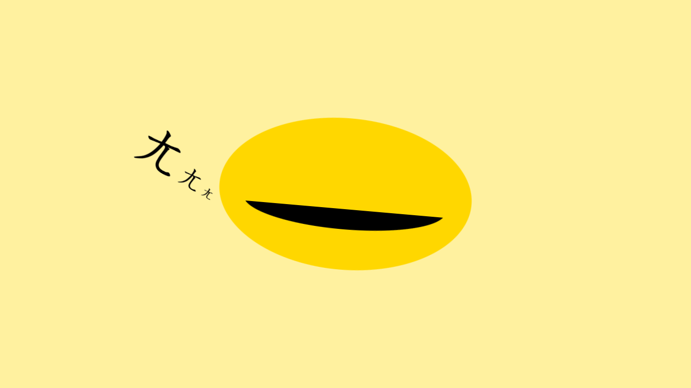
剛好看到不斷重播的中華一番 , 乃哥對決羅根 , 心血來潮也來還原看看 XD
太久沒寫 , 做得有點沙雕 , 不過本來風格就是沙雕 , 有空時在做點油之類的特效好了
See the Pen
Bun by weber87na (@weber87na)
on CodePen.
1
2
3
4
5
6
7
8
9
10
11
12
13
14
15
16
17
18
19
20
21
22
23
24
25
26
27
28
29
30
31
32
33
34
35
36
37
38
39
40
41
42
43
44
45
46
47
48
49
50
51
52
53
54
55
56
57
58
59
60
61
62
63
64
65
66
67
68
69
70
71
72
73
74
75
76
77
78
79
80
81
82
83
84
85
86
87
88
89
90
91
92
93
94
95
96
97
98
99
100
101
102
103
104
105
106
107
108
109
110
111
112
| <!DOCTYPE html>
<html lang="zh-tw">
<head>
<meta charset="UTF-8">
<meta http-equiv="X-UA-Compatible"
content="IE=edge">
<meta name="viewport"
content="width=device-width, initial-scale=1.0">
<title></title>
<style>
* {
margin: 0;
padding: 0;
}
body {
display: flex;
align-items: center;
justify-content: center;
height: 100vh;
overflow: hidden;
background-color: rgb(255, 241, 159);
}
.box {
width: 500px;
height: 300px;
background-color: gold;
border-radius: 50%;
position: relative;
animation: 4s move infinite;
}
.mouth-warp {
/* border: 1px solid red; */
position: absolute;
width: 400px;
height: 100px;
bottom: 20px;
left: calc(50% - 400px / 2);
overflow: hidden;
}
.mouth {
position: absolute;
bottom: 60%;
left: calc(50% - 400px / 2);
width: 400px;
height: 100px;
border-radius: 50%;
background-color: #000;
}
.title {
/* border: 1px solid; */
position: absolute;
transform: rotate(25deg);
top: 20%;
left: -35%;
}
.title span:nth-child(1) {
font-size: 72pt;
}
.title span:nth-child(2) {
font-size: 36pt;
}
.title span:nth-child(3) {
font-size: 18pt;
}
@keyframes move {
0%,
100% {
transform: rotateZ(0deg);
}
20%,
60% {
transform: rotateZ(5deg);
}
40%,
80% {
transform: rotateZ(-5deg);
}
}
</style>
</head>
<body>
<div class="box">
<div class="mouth-warp">
<div class="mouth"></div>
</div>
<h2 class="title">
<span>ㄤ</span>
<span>ㄤ</span>
<span>ㄤ</span>
</h2>
</div>
</body>
</html>
|