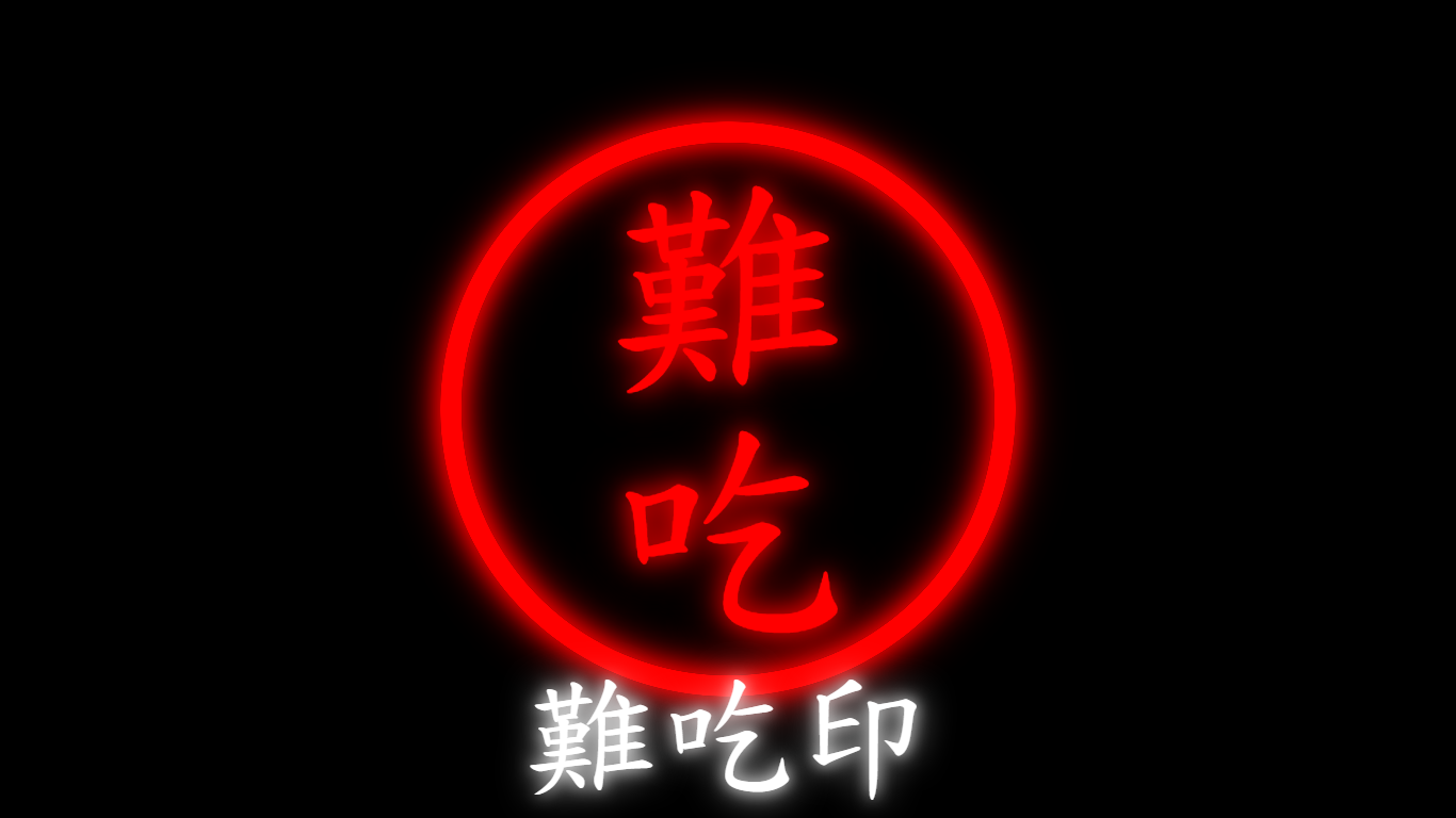
因為中午吃到很雷的店家 , 又剛好看到小當家裡面的難吃印 , 就趁著午休寫看看 XD
感覺很久沒寫 css 了 , 很多功能都忘得差不多 , 還好最後寫起來效果還 ok
比較特別的就這句 writing-mode: vertical-lr; , 可以讓字變成直的排列
另外還順手用 animation 搞點霓虹效果 , 後來順便錄個影片 , 不過 code 不太一樣懶得改 XD
See the Pen
EatLikeShit by weber87na (@weber87na)
on CodePen.
1
2
3
4
5
6
7
8
9
10
11
12
13
14
15
16
17
18
19
20
21
22
23
24
25
26
27
28
29
30
31
32
33
34
35
36
37
38
39
40
41
42
43
44
45
46
47
48
49
50
51
52
53
54
55
56
57
58
59
60
61
62
63
64
65
66
67
68
69
70
71
72
73
74
75
76
77
78
79
80
81
82
83
84
85
86
87
88
89
90
91
92
93
94
95
96
97
98
99
100
101
| <!DOCTYPE html>
<html lang="zh-tw">
<head>
<meta charset="UTF-8">
<meta http-equiv="X-UA-Compatible"
content="IE=edge">
<meta name="viewport"
content="width=device-width, initial-scale=1.0">
<title></title>
<style>
* {
padding: 0;
margin: 0;
}
body {
background-color: #000;
height: 100vh;
display: flex;
}
.box {
width: 500px;
height: 500px;
border-radius: 50%;
border: 20px solid red;
writing-mode: vertical-lr;
display: flex;
margin: auto;
box-shadow:
inset 0 0 15px #f00,
inset 0 0 35px #f00,
0 0 15px #f00,
0 0 35px #f00;
animation: box 1s alternate linear infinite;
}
.bottom-box{
position: fixed;
bottom: 0;
left: 0;
right: 0;
font-family: '標楷體';
margin: auto;
color: #fff;
font-size: 96pt;
text-align: center;
vertical-align: middle;
/* letter-spacing: .5em; */
text-shadow:
0 0 15px #fff,
0 0 35px #fff;
}
.text {
font-family: '標楷體';
margin: auto;
color: red;
font-size: 172pt;
text-align: center;
vertical-align: middle;
text-shadow:
0 0 15px #f00,
0 0 35px #f00;
animation: text 1s alternate linear infinite;
}
@keyframes box {
to {
box-shadow:
inset 0 0 25px #f00,
inset 0 0 45px #f00,
0 0 25px #f00,
0 0 45px #f00;
}
}
@keyframes text {
to {
text-shadow:
0 0 25px #f00,
0 0 45px #f00;
}
}
</style>
</head>
<body>
<div class="box">
<div class="text">
難吃
</div>
</div>
<div class="bottom-box">
難吃印
</div>
</body>
</html>
|